
Apple just announced a brand new design update at the WWDC conference in California. They are calling it Liquid Glass and it is a very controversial design. Let us take you through all the major design improvements and changes they have made across devices.
Glass Based Designs

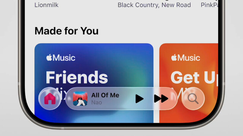
With a transparent background and a slight blur effect, Apple has tried to get into the Glassmorphism design trend while keeping the fundamentals of Apple HIG design intact. However, these transparent designs make for a very hard to read text over images and can cause users to squint to read. This goes against basic accessibility rules in design and can cause unnecessary confusion.

These glass effects are cross platform, which means they are consistent across devices and systems. Liquid Glass is also a present in both dark mode and light mode and constantly changes based on lighting and backgrounds to make for an adaptive design.
The glass also translates to aspects of the UI like app icons, switches, toggles, navigation, and more.
What are the main issues with the glass design?
The glass is too transparent with very little background blur, causing visibility and readability issues for users.
The glass effect is causing performance issues with older Apple products.
Some users have claimed that glass icons are harder to decipher.
Users will have to be careful with the type of wallpapers or background they have.
A Shift to More Playful Animations
Apple is focusing more on what they like to call "dynamic interactions", which adds more playful animations to the UI. Things stretch out, bounce, snap into place, and much more with a smoother more seamless animation.
Apple has also worked on a slew of new animations for elements like switches, sliders, tabs, and more. They are taking a more unconventional and experimental path with this update.
Some animations are as below:


These animations keep the liquid glass effect intact and use it to create an effect. However, these effects are far to detailed for a general user to notice or appreciate and can cause issues with usability in the long run. They also take more time and system resources which is not ideal in most cases.
Major Changes in iPad Functionality
One of the biggest announcements apart from the liquid glass design, was a major update made to iPadOS. iPads will now be more useful and have functionality similar to Macbooks.

iPadOS now has the following functionality, that it didn't have before:
Floating windows for apps and multitasking that can snap to different corners of the display and create a windowed experience for users.
It now has a top menu bar just like with Mac where there are option dropdown menus for each app. This is super useful for us!
iPads now have a much more powerful and detailed file manager, that allows users to easily manage and organise files and folders on their iPad, bringing it closer to the Mac file management.
Apps like video editors can now work in the background to allow users to truly multitask while doing heavier tasks.
Needless to say, iPad also gets the glass effect update just like all the other devices.
New Style of 3D App Icons

The app icons in iOS have needed a refresh for a very long time. Users have been asking for a change for quite some time now. The new 3D icons offer a slight change with a new aesthetic.
However, Apple has also introduced a new transparent icon style that a lot of users do not like. These transparent icons are harder to decipher and the style is only supported by official Apple apps right now, making some icons on the screen seem out of place.

Apart from all the criticism that Apple has been facing, we have enjoyed some aspects of the design, and we have our fingers crossed that Apple will fix the current issues in the upcoming beta updates, so as to have a better release at the end of the year.
